Strong and Simple: Discovering Fairfield Porter
By Charles Sovek
The Artist's Magazine - May, 1992
The secrets of saying a lot with Spartan means.
With the simplicity of a silk - screen print, Fairfield Porter captured a moment in time, defined the character of a figure or bathed a subject in light. His pictures are the kind that make you scratch your head and wonder just how imagery so simple can say so much. He turned a nearly childlike approach to flat shapes into an important vehicle of expression, forever getting strong results with Spartan means. He eschewed a preplanned technique, but his finished works have a lot to teach any painter about picture-making.
 |
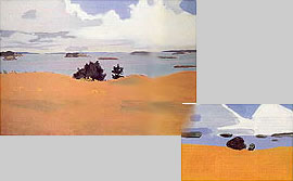
Knowing the Essentials to Leave Out - Like a well-designed flag or coat of arms, notice how even a diagram (below, right) of the composition of Penobscot Bay with Yellow Field (37 1/8 x 54) still reads as a visually arresting pattern of shapes and colors. Each detail in Porter’s finished painting above is considered with this end in mind. Hundreds of pictures are probably painted along this scenic strip of Maine seacoast each year, but few capture the sense of place as well as this one. Without relying on picturesque fishing boats, sea gulls or clever reflections, Porter reveals the essence of his subject. The foreground field, for instance, fails to show a single blade of grass. Yet the mood and feeling of space is not only intact, but is heightened by the power of suggestion.
|
AN EARLY START
Born in 1907, Fairfield Porter was encouraged at a very early age to "express himself." His father was an architect, and both his parents instilled in their children a taste and aptitude for writing and the arts. In 1912, the family moved to an island in Penobscot Bay, Maine. Here, young Porter first experimented with plein air sketching in pastels and watercolor. He would also go on to paint some of his finest works in and around this family home.
A precocious teenager, Porter was admitted to Harvard at age 16; there he studied art history and was stirred by the teaching of Arthur Pope. He also spent two years at the Art Students League of New York working with Thomas Hart Benton and Boardman Robinson.
After numerous trips abroad studying the works of the Old Masters, the artist settled in 1949 in Southhampton, New York, where he developed friendships with other Long Island painters, including Jane Freilicher, Larry Rivers, Robert Dash, Jane Wilson and Paul Georges. He also became an associate editor of Art News, for which he wrote reviews and articles primarily about contemporary art. Having now achieved a secure reputation, Porter continued to exhibit and write until his untimely death in 1975.
Porter discovered in modern art the same thing the Impressionists discovered in their movement. He believed that "the Impressionists' revolution implied that the value of art was intrinsic, and that this was much more of a revolution than anything that succeeded it." In other words, it was the quality and nature of paint and how Porter could get it onto a canvas without being manipulative or self-imposing that formed his approach to painting. This also meant using whatever colors, including black, that did the job best.
|
|
Click for larger image - 65KB
(Opens in new window)

|
|
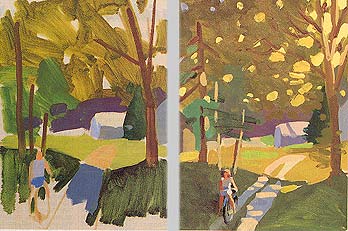
Stage One: The Large Shapes - To understand more about Porter's painting process, I created the first two stages of The Garden Road as he might have (above). I toned the canvas with a wash of yellow ochre and black, and positioned the forms on the canvas with a large brush, always stressing the big mosses. Even this early on, the arrangement of the overall patterns is clear.
|
Stage Two: Keep the Development Even - The next step shows the development of the secondary shapes within the large masses. This is a critical point in the painting because if the secondary passages don't lock together artfully, the area gets wiped clean and the passage restated. Every pail of the composition is developed with clarity and definition, with no attempt made to highlight a focal point or center of interest. |
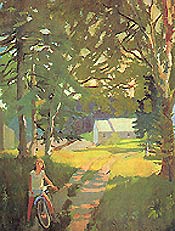
The Finish: Avoid Detail - Like a candid snapshot, The Garden Road (62 x 48) has an intimacy that would have been lost if the various forms had been overly detailed. The child and bike, for instance, have been simplified into a few poster-like tones, while the trees and distant building take on an almost stage set flatness Rather than playing up the child and bike as storytelling devices, Porter underplayed them and used them simply as shape-making pieces in his compositional puzzle. Because spontaneity was more important to the artist than correctness, Porter left no qualms about leaving the front wheel of the bicycle slightly lopsided, not to mention leaving out the spokes - all of which makes a good case for a pleasingly inaccurate statement taking precedence over a correct, yet finicky one.
|
Porter related to Vuillard in particular because of his ability to balance his love of the medium with his love of visual reality. So taken was he after seeing a large exhibition of Vuillards at the Chicago Art Institute in 1938 that he wrote, "Why does one think of doing anything else when it is so natural to do this?" Of course there were other influences, such as Giotto, Piero della Francesca, Tintoretto, Rubens and Velazquez, as well as his contemporary, John Marin. But Vuillard seemed to hold the key, showing Porter how to compose exciting patterns of shapes and colors without losing the feeling of space and dimension. No small feat!
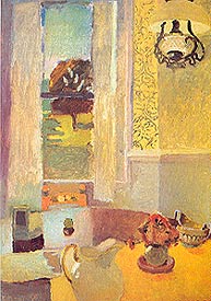
I think Porter's nature straddled the fence between flat and round; Vuillard probably helped him realize this inherent quality. The technique used to paint Still Life with Yellow Tablecloth (below), for example, relies heavily on Vuillard's fondness for building a painting with small, hatch-like brushstrokes.
Equally obvious is Porter's patterning of the composition. Notice for example, how the table, wall, curtains and background are reduced to flat, geometric shapes that interlock to form a striking design. Also study how the artist minimized the cast shadows from the objects on the table, yet emphasized the shadows on the lawn seen through the open window. This kind of "flattening out" of forms is essential in balancing both the two- and three-dimensional aspects of a composition.
HANDLING PAINT
In 1942, Porter began taking night classes at the Parsons School of Design with Jacques Maroger. It was here that he began using a medium developed by Maroger that went back to the Flemish and Venetian masters. An exotic mixture made from black oil (linseed oil saturated with lead by cooking it with litharge, or white lead) and mastic varnish, Porter found the medium ideal for his particular oil painting technique, and, except for a short stint of working with acrylics in the 1960s, he used it exclusively for the rest of his life.
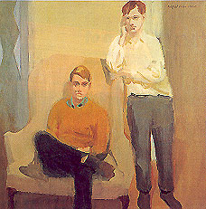
The advantage of the medium is that it enables one wet stroke of paint to be placed over another without the usual smearing. Since Porter used mostly an alla prima technique, this medium let him work quickly over wet passages. Study the figure on the right in Portrait of Ted Carey and Andy Warhol (below) and notice the crisp, painterly effect of the hands, face and shirt. Even though the strokes are applied wet-into-wet, the passage retains the look of fresh, buttery oil paint.
I've found that both stand oil (thick, not thin) and many of the gel mediums on the market can closely duplicate Maroger's medium, which is potentially toxic to make and difficult to purchase. Of the commercial gel mediums, I'd try Res-N-Gel (Martin F. Weber) first, but others to experiment with include Grumbacher's Zec, Utrecht's FlexGel I ' and Winsor & Newton's Win-Gel.
FINDING THE PATTERN
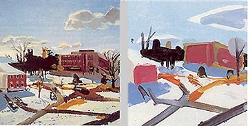
Fairfield Porter used patterns of colors and shapes to set a mood in the same way Rembrandt used light and shadow. Penobscot Bay with Yellow Field (above) and The Campus (below) are eloquent examples of this.
Study my diagrams and notice how the artist restricted himself to three meager values; a light, medium and dark. Yet the result is an impeccably composed tapestry, complete in every sense of the word. The sky in both paintings, for example, captures a feeling of light found only by direct observation of nature – yet how simply the passages are painted. So, too, with the water and snow. Aside from a stripe of lavender placed through the center of the water in Penobscot Bay with Yellow Field, the entire expanse is painted with a single shade of pale cobalt blue. Likewise, except for the stacatto-like footprints and cast shadow from the buildings, the snow in The Campus is a clean field of flat white.
Most important, however, is the way Porter has interlocked the various shapes. Nothing here is static; everything interlocks and forms a cohesive whole that would be destroyed if a single shape was removed or altered. And while the results have the freshness of a fleeting image glanced in a rear-view mirror, they also reflect a timelessness that few painters achieve.
BREAKING THE RULES
Fairfield Porter had enormous respect for the wholeness, uniqueness and presence of the visual world. For this reason, many of his compositions break the rules academicians prescribe for successful picture-making.
His reasoning is best summed up in a statement he wrote about the work of Jane Freilicher: "...when she has to choose between the life of the painting and the rules of construction, she decides to let the rules go. The articulation of some of the figures is impossible and awkward, and though this is a fault, it is a smaller fault than murder." Porter, too, was willing to depart from traditional structure when necessary for aesthetic wholeness, but he also shows a great respect for this same structure.
|
|
|
Getting Direct - Avoiding sophisticated techniques such as underpainting or glazing, Porter opted for a nearly childlike approach that perfectly captures the bracing chill of a winter day in The Campus (30x28). If you removed the stark clump of black trees to the left of the distant building, the feeling of light, air and expansiveness that gives mood and drama to the scene dissolves into postcard-like ordinariness.
|
The Stark Structure - I made this sketch as an exercise to investigate the structure of the painting, and found that it's impossible to simplify this painting more than Porter has already done. Even the details of the finished work are designed to contribute to the integrity of the composition as a whole. |
A good example of his rule-breaking can be found in Penobscot Bay with Yellow Field, where he places the horizontal band of water through the exact center of the composition. He also made a bull's-eye by positioning the dark trees directly in the center of the picture. In both instances of blatant rule-breaking, the painting emerges unscathed because, rather than relying on the conventional device of a center of interest with "artfully" orbiting secondary forms, everything is painted with equal emphasis. The result is not only a striking fabric of colorful shapes, it's also a convincing slice of reality.
Another example is The Campus, in which Porter not only split the composition in half again, but also reversed the time-honored rule of decreasing value contrasts as forms recede into the distance. Observe the near-black clump of background trees silhouetted against the sky and snow. Now notice how much lighter the dark pathways in the foreground and middleground appear. So why does the painting perfectly capture the ambience of a bright winter day? Again, the answer is in how the artist turned what could have been an ordinary subject into an extraordinarily vivid arrangement of patterns.
HOW IT HAPPENS
Like many other painterly realists, Porter preferred to work from life. He was also particular about not deviating from one lighting effect to another. While even a large work might take but a few hours to execute, the mentality behind the brush was years in the making.
It's difficult to know the exact procedure any painter uses, but an educated guess as to Porter's methods could be something like this: The artist first needed to be stirred by something, or, as Pissarro said, to feel a sensation. This could mean a chance glance at a singular lighting effect or a collection of interesting patterns. It's important to remember that Porter found anything and everything a possible subject. The front of an old Volvo, a pipe-entwined storage tank, dishes - left on a table after a meal, a bare wooden dressing table or an old woman asleep in bed with a princess telephone next to her - all are motifs the painter exploited.
Next came the execution. In any medium, the technique was less important than the attitude that painting means "…not knowing what you're going to do ahead of time. The ability to be open to what is happening while you work." In other words, Porter let his paintings grow organically rather than trying to impose any preconceived formulas or rules.
A peek over Porter's shoulder at this point would probably reveal him establishing the large masses with generous amounts of paint. Next would come the intermediate stage: defining various passages with whatever details he felt would help give substance to his initial sensation. Again, Porter wasn't trying to make a literal copy of what he saw, but rather to use the motif as a catalyst to release his feelings about what he was painting via his love of paint and color. When this was accomplished, the picture was finished.
Unlike many traditional painters, it's doubtful that Porter could say just why he was using such-and-such a color or shape, because if he knew, it meant he had a plan. And a contrived picture was something he desperately tried to avoid. This kind of thinking could be an excellent remedy for students caught in the rut of rules and formulas, or for those fearful of tackling new subjects.
Study my three-step demonstration of The Garden Road (above) to see what methods the artist might have used to paint the picture. Remember, however, that Porter, like Monet, tried to approach each subject with the innocence of one who's never painted before, so understand that the procedure shown could vary a great deal from picture to picture.
TAKING A RISK
Fairfield Porter's own words best sum up the elusive goal he spent his life pursuing: "Order seems to come from searching for disorder, and awkwardness from searching for harmony or likeness, or the following of a system. The truest order is what you already find there, or that will be given if you don't try for it. When you arrange, you fail."
What we can learn from Porter's words is to push aside all the rules it took so long to learn, discarding those favorite subjects you do so well and getting risky. Fairfield Porter did it his way, and everyone has a similar capacity to respond to the uniqueness of everyday life. All that's needed is a blank canvas and an open mind.
Skipping the Specifics - In Portrait of Ted Carey and Andy Warhol (below left, 40 x 40), Porter was less interested in conventional portraiture than in snaring an impression of the unique shapes and colors the subjects displayed. Similarly, in Still Life with Yellow Tablecloth (below right, 44 x 30), detail is reduced. the wallpaper, for example, could have overwhelmed the picture If the artist hadn't reduced the curly patterns of the design down to some suggestive squiggles. Also notice how all the planes have been flattened so as not to disturb the integrity of the composition's twodimensional design. In the portrait at left, the entire composition is held together by a deceptively simple arrangement of subdued earth colors. In the hands of a conventional portrait painter, a more detailed representation could have been presented, but I doubt the spirit of casual youthfulness he portrayed could have been surpassed.
 
Quotes from Porter come from a collection of his critical essays, Art In Its Own Terms, edited by Rackstraw, Downes (Taplinger Press, New York), or from an interview conducted by Paul Cummings and published in Fairfield Porter (1907-1975): Realist Painter in an Age of Abstraction (Museum of Fine Arts, Boston).
|

![]()
